
You built a website. You’re proud of it—it looks good, it exists, which honestly took more effort than anyone warned you about. And yet, people are landing on it and then… leaving. Quietly. Without booking a call, buying your thing, or even really engaging with it at all.
If your website isn’t converting, you’re not alone, and it’s probably not what you think. It’s rarely about aesthetics and it’s not usually about needing more pages, a fancier font, or a complete rebrand (I know, I know, it’s tempting).
Here are five of the most common reasons websites don’t convert, and exactly what to do about each one.
Why websites don’t convert: the short answer
Most of the time, a website that isn’t converting is missing one or more of these five things: clear messaging that makes visitors instantly get what you do, a strong call to action that actually tells people what to do next, credibility markers that build trust, a design that doesn’t overwhelm people, and a way to nurture visitors who aren’t ready to buy yet.
Nail these five things and your website will go from working against you to working for you—which is, after all, the whole point of having one.
1. Your messaging is too vague
Most people don’t have a traffic problem, they have a clarity problem. Someone lands on your homepage and within about three seconds they’re asking themselves: what is this, is it for me, and what do I do next? And if they can’t immediately find the answer—they’re gone. Not because they weren’t interested, but because you made them work too hard to find out.
Vague messaging is sneaky because it rarely feels vague from the inside. When you write “I help people live their best life” or “welcome to my world,” it feels inviting and inclusive, but really it’s speaking to nobody in particular. The person you most want to work with lands on your page, doesn’t see themselves reflected anywhere, and clicks away—and you never even knew they were there.
Specific messaging does the opposite. It makes the right person feel like you’re talking directly to them, and it lets the wrong person quietly opt out before you’ve both wasted an hour on a discovery call going nowhere.
The Fix
Rewrite your headline so it answers three things at once: who you help, what you help them with, and what life looks like on the other side. Something like “I help burnt-out teachers leave the classroom and build a career they actually want” is specific enough to make the right person stop scrolling and think you wrote it just for them. Once your headline is working, run the same check over your subheadings, your about page, and your services page—the vagueness has a tendency to spread further than you think.
2. There’s no clear call to action
Someone lands on your page, sees five different buttons all shouting for attention, and does the very human thing of choosing none of them. It’s not indecision, it’s just how we’re wired—when everything feels equally important, our brains check out.
The issue isn’t having multiple elements on your page, it’s not having one primary action that’s clearly leading it. If everything is given equal weight, nothing stands out, and your visitor ends up doing a full scroll-through of your site without actually going anywhere (and that’s if they stick around that long).
Think about the journey you want someone to take from the moment they land on your homepage. Where do you want them to go first? What do you want them to do when they get there? That’s your primary CTA—and it should be the thing your page keeps coming back to, not a detail buried somewhere near the footer.
The Fix
Identify your one primary call to action—booking a discovery call, signing up for your freebie, browsing your services—and make it the clear through-line of your page. Secondary options can still exist, they just shouldn’t compete for the same attention. A good rule of thumb is to include your primary CTA at least three times on your homepage—near the top, in the middle, and at the bottom. Not sure what yours should be? Ask yourself: what’s the one thing that, if more people did it, would actually move the needle for my business right now?
3. It doesn’t build trust fast enough
People don’t buy from websites, they buy from people. And if someone lands on your site and can’t find a photo of you, a sentence about who you are, or any sign that you’ve actually helped anyone before, they’ll likely leave feeling a little unsure. Not because your offer isn’t good, but because they don’t have enough to go on yet.
This is especially true for service-based businesses where the relationship is a big part of what people are paying for. If you’re a therapist, coach, or consultant, people want to get a feel for you before they commit to anything—and your website is often the first place that happens.
Trust doesn’t require a huge portfolio or years of experience. It requires honesty, visibility, and a few intentional things that tell people you know what you’re doing and that others have been glad they worked with you.
The Fix
Make sure your site has at least one good photo of you (not a stock image—your actual face!), a short line or two about who you are and why you do what you do, and some form of social proof. A single testimonial from a real person, even a short one, goes a long way. If you’re just starting out and don’t have testimonials yet, a case study, a result, or even a clear articulation of your own experience and why it qualifies you to help can work just as well. This isn’t about being perfect or having a big audience, it’s about giving people enough to feel like they know you a bit before they hand over their email address or their hard earned cash. A little really does go a long way here.
4. Your design is overwhelming people
Research consistently shows that users form an opinion about a website within the first few hundred milliseconds of landing on it. That first impression is almost entirely visual. If your site looks cluttered, dated, or hard to navigate, people will assume (fairly or not) that your services reflect that too.
Good design is as much about knowing what to leave out as what to put in. White space is one of the most underrated design tools because it’s not just empty space—it’s what gives the important things room to breathe. A page that tries to lead with bold typography, a video background, four different font styles, a pop-up, and an announcement bar all at once isn’t exciting, it’s exhausting. Your visitor’s eye doesn’t know where to go, so it goes nowhere.
The sites that convert well tend to be the ones that feel considered. Clean navigation that doesn’t make people think. A visual hierarchy that gently guides the eye from one thing to the next. Enough breathing room that the content actually has a chance to be read. It sounds simple, and it is—but simple requires being intentional.
The Fix
Go through your site and ask yourself honestly: does every element here earn its place? If something isn’t guiding your visitor, building trust, or moving them toward your CTA, it might just be noise. Check your navigation is straightforward and your most important pages are easy to find. And if your homepage feels busy, don’t add more—take things away. A page that does less, but does it clearly, will almost always outperform one that tries to do everything.
5. There’s nothing for people who aren’t ready to buy yet
Most visitors who land on your website aren’t going to enquire straight away. They’re in research mode, getting a feel for you and seeing what’s out there. If your website has nothing to offer someone who isn’t at the “take my money” stage, you’re catering exclusively to people who are already pretty much decided, and you’re losing everyone else the moment they leave your site.
This isn’t a failure of your offer. It’s just how people make decisions, especially when it comes to investing in a service. A great way to engage people at this stage is to invite them into your world with something low-commitment and genuinely useful.
A newsletter they actually want to read, a blog that answers the questions they’re already searching for, or a free resource that makes their life a little easier—any of these can do the job.
In exchange, you get to land in their inbox, which is a much warmer place to nurture a relationship than hoping they remember to Google you again in three months. The point is simply to give people somewhere to go that isn’t a booking page, so that when they are ready, you’re the first person they think of.
The Fix
Add one low-commitment touchpoint to your homepage: an email opt-in with a freebie is the most effective place to start. Keep the ask small and the value obvious, and make sure it’s visible without someone having to hunt for it. You’ve already done the hard work of getting people to your site—this is just making sure they don’t leave empty-handed.
A quick website audit: where to start
If you’ve read through this and thought “I need to fix all five of these,” know that it doesn’t have to be as daunting as it might feel right now. Start simple: spend twenty minutes going through your homepage with fresh eyes, or better yet, ask someone who’s never seen your site before to take a look and tell you what they think you do within thirty seconds of landing on it. Their answer will usually point you straight to what you need to work on.
From there, work through the list in order. Messaging first (because everything else depends on it), followed by your primary CTA, the trust-building elements, the design, and then your nurture strategy.
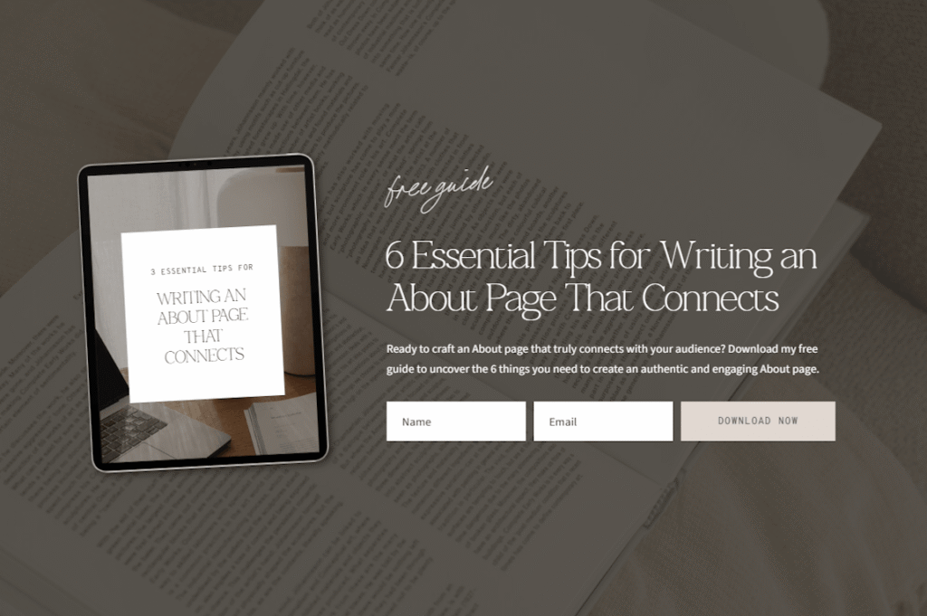
Small, consistent improvements beat a full overhaul that never happens. And if you’re at the point where you’d rather just start fresh with a design that already has all of this baked in, that’s exactly what our templates are built for. Browse the shop and find one that feels like you.
Frequently Asked Questions
Why is my website getting traffic but no conversions?
Traffic without conversions usually means one of a few things: your messaging isn’t speaking to the right person, there’s no clear next step for visitors to take, or the site isn’t building enough trust quickly enough. Start by looking at your homepage headline and your primary call to action.
What is a good website conversion rate?
For service-based businesses, a conversion rate of 2-5% is considered healthy, though this varies depending on your traffic source and what you’re asking people to do. If you’re getting consistent traffic and seeing less than 1%, it’s worth auditing your site against the five points above.
How do I get more enquiries from my website?
The fastest wins usually come from clarifying your messaging, adding or simplifying your call to action, and making sure there’s visible social proof on your homepage. These three changes alone can make a big difference without touching your design.
How long does it take to improve website conversions?
Some changes, like rewriting your headline or adding a testimonial, can be made in an afternoon and show results within weeks. Bigger structural changes take longer, but you don’t need to fix everything at once. Start with the highest-impact area first.
Do I need to redesign my website to improve conversions?
Not necessarily. Many conversion issues are messaging and structure problems, not design problems. That said, if your site is hard to navigate or not mobile-friendly, a fresh design built with conversion in mind can make a big difference. A good template is often the most efficient way to get there.
How do I know if my website messaging is clear enough?
The simplest test is to ask someone who knows nothing about your business to look at your homepage for thirty seconds and then tell you what they think you do and who you help. If they can’t answer accurately, your messaging needs work. You can also use tools like Microsoft Clarity or Hotjar to see where people are dropping off, which often points directly to where the messaging or design is losing them.


Leave a Reply