
Let’s be honest—choosing fonts for your website is one of those things that sounds simple until suddenly it’s 11pm and you’re down a rabbit hole of serif vs sans-serif, wondering if you’ve lost the plot entirely. (No? Just me?)
If you’ve been building or refreshing your Showit website and you’re staring at a blank canvas wondering what fonts will actually make your brand look as good as you know it can, this post is for you.
I’ve put together 12 free commercial font pairings that are totally free to use on your website and in your business, and hand-picked to work brilliantly on Showit websites. Not on Showit? No worries—these pairings work beautifully on any platform, and every single one is free to download and use wherever you build.
Whether you’re after something modern and minimal, warm and approachable, luxurious and editorial, or bold and full of personality—there’s a combination here with your name on it. And the best bit? You don’t have to spend a single penny to make your website look like a million dollars.
What does ’free for commercial use’ actually mean?
Quick note before we dive in: not all free fonts are created equal. Some free fonts are fine for personal use but require a licence if you’re using them in a business context (e.g. on your website, in your branding, on social media etc). The font pairings in this post are all free for commercial use, meaning you can use them on your Showit website and anywhere else in your business, and sleep soundly at night. You’re welcome.
Most of these are available on Google Fonts (where all fonts are free to download and use) or other reputable free font platforms. I’ll note where to grab each one as we go.
And if you’re building on Showit, the good news is you don’t even need to leave the platform. Showit has Google Fonts built directly into your Design Settings, so you can search for any of these fonts by name and add them to your site in a couple of clicks. Just head to Design Settings > Fonts, search for the font you want, and hit ‘Add Google Font’.
Before you dive in: a note on styling your fonts
The way you style your fonts matters just as much as the fonts themselves. Playing with uppercase lettering on a subheading can add instant structure and sophistication.
A touch of letter spacing on a heading makes it feel more considered and editorial, and don’t be afraid to go negative either—pulling the letters closer together can give a heading a sleek, intentional quality that feels like it was professionally designed (I’ve used negative letter spacing in a number of the examples in this post!).
If your font has an italic version, switching a heading to italic creates movement and personality without changing the font.
None of these cost anything, none of them require a designer, and all of them can completely change the feel of a combination. So as you work through the pairings below, don’t just take them at face value—have a play and see what feels best for your brand!
Font Combination 1: The Friendly Expert
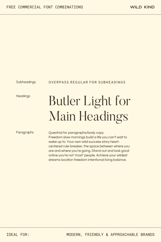
Heading Font: Butler Light—a refined serif with elegant contrast that feels editorial without being intimidating
Subheading Font: Overpass Regular—a clean, grounded sans-serif that bridges the gap beautifully between decorative and functional
Paragraph Font: Questrial—a friendly, geometric sans-serif that’s incredibly easy to read and has just enough personality to feel considered
The Vibe
This combination is what happens when warmth and polish decide to stop competing and just get along. Butler Light gives your headings a quiet confidence, while Overpass and Questrial keep everything feeling fresh, open, and easy to connect with.
Ideal For
These fonts are perfect for modern, friendly and approachable brands—think service providers, coaches, or creatives who want their website to feel elevated but never intimidating. The kind of brand where people land on your homepage and immediately think “I like this person already.”
Why It Works on a Website
The contrast between Butler Light’s delicate serifs and the clean geometry of Overpass and Questrial creates natural visual hierarchy. Your headings draw the eye, your subheadings guide the reader, and your body copy keeps them there.
Where to Download
Butler Light: Fabien de Smet
Overpass Regular: Google Fonts
Questrial: Google Fonts
Font Combination 2: The Credible Creative
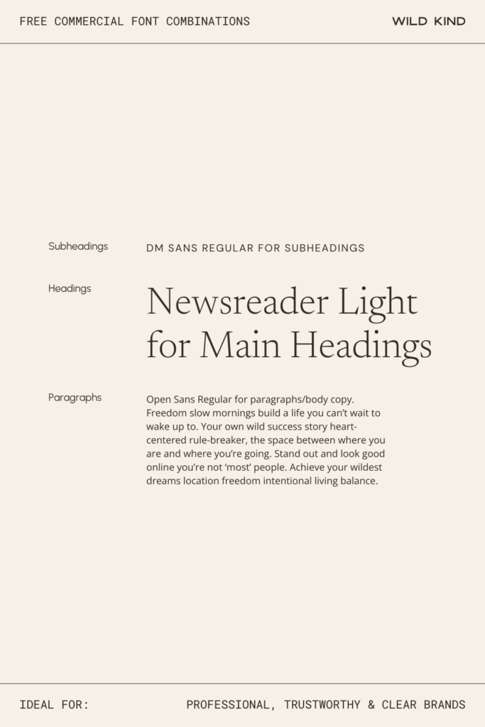
Heading Font: Newsreader Light—a journalistic, considered serif that feels sharp and trustworthy at heading size
Subheading Font: DM Sans Regular—clean and neutral, it bridges editorial and modern without missing a beat
Paragraph Font: Open Sans Regular—one of the most reliably readable fonts on the web, and for good reason
The Vibe
This pairing means business in the nicest possible way. Newsreader Light brings a journalistic, considered quality to your headings, while DM Sans and Open Sans keep everything clean, legible, and refreshingly no-nonsense. It’s the typographic equivalent of a really well-written proposal: clear, confident, and impossible to ignore.
Ideal For
These fonts are perfect for professional, trustworthy and clear brands—the kind of business that doesn’t need to shout because the work speaks for itself. Think consultants, lawyers, financial coaches, or service providers who want their website to feel as sharp as they are.
Why It Works on a Website
Newsreader Light’s editorial serif headers paired with the clean neutrality of DM Sans and Open Sans create a hierarchy that feels effortless—structured enough to build trust, open enough to stay approachable.
Where to Download
Newsreader Light: Google Fonts
DM Sans Regular: Google Fonts
Open Sans Regular: Google Fonts
Font Combination 3: The Modern Classic
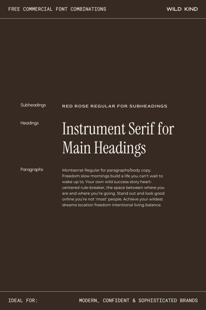
Heading Font: Instrument Serif—contemporary and fresh, with a confidence that feels neither old-fashioned nor try-hard
Subheading Font: Red Rose Regular—adds just enough personality to subheadings to keep things genuinely interesting
Paragraph Font: Montserrat Regular—geometric, solid, and reliably modern; the backbone every good layout needs
The Vibe
This is quiet confidence with great bone structure. Instrument Serif has a contemporary freshness that feels neither old-fashioned nor try-hard, Red Rose adds just enough personality in the subheadings to keep things interesting, and Montserrat grounds it all with its reliable, modern solidity. Together they feel like a brand that really knows who it is.
Ideal For
These fonts are perfect for modern, confident and sophisticated brands—creatives, strategists, coaches and consultants, or anyone who wants their website to feel like it belongs in a high-end editorial spread without losing an ounce of clarity.
Why It Works on a Website
The interplay between Instrument Serif’s contemporary letterforms and Montserrat’s geometric structure gives your pages a sense of intention. Every section feels designed, not just put together.
Where to Download
Instrument Serif: Google Fonts
Red Rose Regular: Google Fonts
Montserrat Regular: Google Fonts
Font Combination 4: The Bold Statement
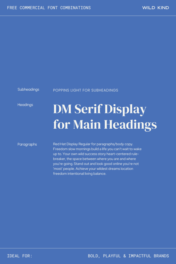
Heading Font: DM Serif Display—high contrast and full of drama, in the best possible way
Subheading Font: Poppins Light—soft and airy, it gives the layout room to breathe after those punchy headings
Paragraph Font: Red Hat Display—slightly technical and energetic, it keeps body copy moving with purpose
The Vibe
This one walks into the room first. DM Serif Display is all high contrast and drama in the best possible way, while Poppins Light keeps the subheadings soft and breathing. Red Hat Display brings a slightly technical, energetic edge to the body copy. It’s punchy, it’s fun, and it absolutely does not blend in.
Ideal For
These fonts are perfect for bold, playful and impactful brands—think brand strategists, disruptive startups, educators, or anyone building something that’s meant to be remembered. If your brand has a point of view and isn’t shy about it, this pairing will keep up with you.
Why It Works on a Website
The contrast between DM Serif Display’s dramatic headings and the lightness of Poppins creates a visual rhythm that pulls readers down the page—bold enough to stop the scroll, light enough to keep them reading.
Where to Download
DM Serif Display: Google Fonts
Poppins Light: Google Fonts
Red Hat Display: Google Fonts
Font Combination 5: The Rule Breaker
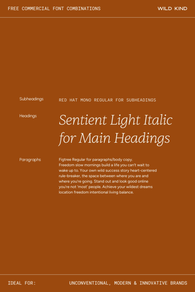
Heading Font: Sentient Light Italic—flowing and almost handcrafted in quality, with an unexpected elegance that stops people in their tracks
Subheading Font: Red Hat Mono Regular—quietly technical and code-meets-creative; a subheading font that earns a second look
Paragraph Font: Figtree Regular—grounded, modern, and genuinely readable; the reliable anchor this expressive combination needs
The Vibe
This combination doesn’t follow the rules and that’s exactly what makes it work. Sentient Light Italic brings an unexpected, flowing quality to headings that feels almost handcrafted, Red Hat Mono adds a quietly technical, code-meets-creative energy to subheadings, and Figtree keeps the body copy grounded and genuinely readable. It’s the kind of pairing that makes people stop and actually look at your website.
Ideal For
These fonts are perfect for unconventional, modern and innovative brands—think brand designers, creatives, forward-thinking studios, or anyone who finds the usual clean and minimal approach a little bit boring. If your brand is doing something that hasn’t quite been done before, your fonts should feel that way too.
Why It Works on a Website
The contrast here is doing something genuinely interesting—italic serif meets mono meets geometric, and somehow it all coheres. It creates a visual personality that’s hard to put your finger on but impossible to forget.
Where to Download
Sentient Light Italic: Fontshare
Red Hat Mono Regular: Google Fonts
Figtree Regular: Google Fonts
Font Combination 6: The Timeless One
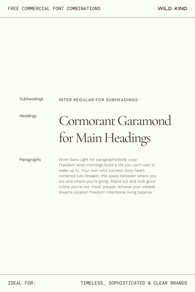
Heading Font: Cormorant Garamond—graceful, literary, and utterly beautiful at large sizes; one of those heading fonts that makes everything it touches feel more considered
Subheading Font: Inter Regular—clean and modern, it ensures elegance never tips into fussiness
Paragraph Font: Work Sans Light—open, honest, and effortlessly readable; the perfect supporting act
The Vibe
Some font combinations are trendy. This one is just always going to be right. Cormorant Garamond is one of those heading fonts that makes everything it touches feel a little more considered—graceful, literary, and beautiful at large sizes. Inter and Work Sans Light keep the reading experience clean and modern, making sure elegance never tips into fussiness.
Ideal For
These fonts are perfect for timeless, sophisticated and clear brands—interior designers, high-end professionals, authors, consultants, or anyone building a brand they want to feel just as relevant in ten years as it does today.
Why It Works on a Website
Cormorant Garamond’s fine strokes and generous proportions shine at heading size, and the neutrality of Inter and Work Sans means your content always takes centre stage—the typography supports without competing.
Where to Download
Cormorant Garamond: Google Fonts
Inter Regular: Google Fonts
Work Sans Light: Google Fonts
Font Combination 7: The Straight Talker
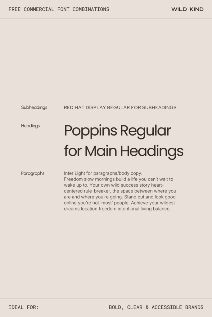
Heading Font: Poppins Regular—friendly, rounded, and immediately approachable; the sans-serif that everybody likes
Subheading Font: Red Hat Display—adds a slightly technical, energetic character that stops this trio from feeling too safe
Paragraph Font: Inter Light—clean, open, and an absolute pleasure to read at any size
The Vibe
No fuss, no frills, just really good design. This is a sans-serif trio that works harder than it looks—Poppins Regular brings a friendly roundness to your headings, Red Hat Display adds just enough technical character to the subheadings to keep it interesting, and Inter Light makes your body copy an absolute pleasure to read.
Ideal For
These fonts are perfect for bold, clear and accessible brands—think virtual assistants, educators, course creators, or anyone who needs their website to communicate quickly and clearly without sacrificing personality. If your audience includes people who are busy and need to get the point fast, this one’s your friend.
Why It Works on a Website
Three well-chosen sans-serifs that actually complement each other are rarer than you’d think. This combination creates hierarchy through weight and character contrast rather than serif vs sans contrast—and it works beautifully.
Where to Download
Poppins Regular: Google Fonts
Red Hat Display: Google Fonts
Inter Light: Google Fonts
Font Combination 8: The Warm Professional
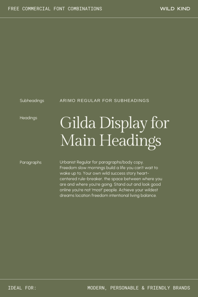
Heading Font: Gilda Display—soft, slightly romantic, and quietly distinguished; warmth without a hint of overdoing it
Subheading Font: Arimo Regular—grounded and trustworthy, it keeps Gilda’s softness from floating away
Paragraph Font: Urbanist Regular—contemporary, airy, and open; it makes every page feel like there’s room to breathe
The Vibe
This pairing has a warmth to it that’s hard to manufacture—it just feels genuinely nice. Gilda Display brings a soft, slightly romantic quality to headings that never feels overdone, Arimo keeps subheadings grounded and trustworthy, and Urbanist adds a contemporary, airy quality to body copy that makes everything feel open and inviting—like a really good conversation with someone who’s both brilliant and kind.
Ideal For
These fonts are perfect for modern, personable and friendly brands—therapists, coaches, photographers, wellness professionals, or creative service providers who want their website to feel like a warm handshake rather than a cold pitch.
Why It Works on a Website
Gilda Display’s gentle personality softens what could otherwise be a very corporate-feeling clean layout—it adds just enough warmth to make visitors feel welcome without losing any of the professionalism.
Where to Download
Gilda Display: Google Fonts
Arimo Regular: Google Fonts
Urbanist Regular: Google Fonts
Font Combination 9: The Trusted Friend

Heading Font: Sentient Regular—grounded and steady, with a quiet assurance that feels present without being pushy
Subheading Font: Figtree Light—open and honest, it creates subheadings that feel easy to trust
Paragraph Font: Source Sans Light—clean, warm, and dependably readable; the written equivalent of a reassuring nod
The Vibe
This combination feels like it gives really good advice. Sentient Regular has a grounded, steady quality in headings—present and assured without being pushy—and Figtree Light and Source Sans Light keep everything feeling open, honest, and easy to spend time with. It’s the typographic version of someone who just gets it.
Ideal For
These fonts are perfect for warm, friendly and trustworthy brands—nutritionists, counsellors, parenting coaches, VA businesses, or any service provider whose clients need to feel completely at ease before they reach out. If trust is the most important thing you’re building, this pairing is doing a lot of the heavy lifting for you.
Why It Works on a Website
The softness across all three weights creates a reading experience that genuinely feels gentle—nothing here is sharp or jarring, which means visitors stay longer and feel safer. In the best way.
Where to Download
Sentient Regular: Fontshare
Figtree Light: Google Fonts
Source Sans Light: Google Fonts
Font Combination 10: The Bold Innovator
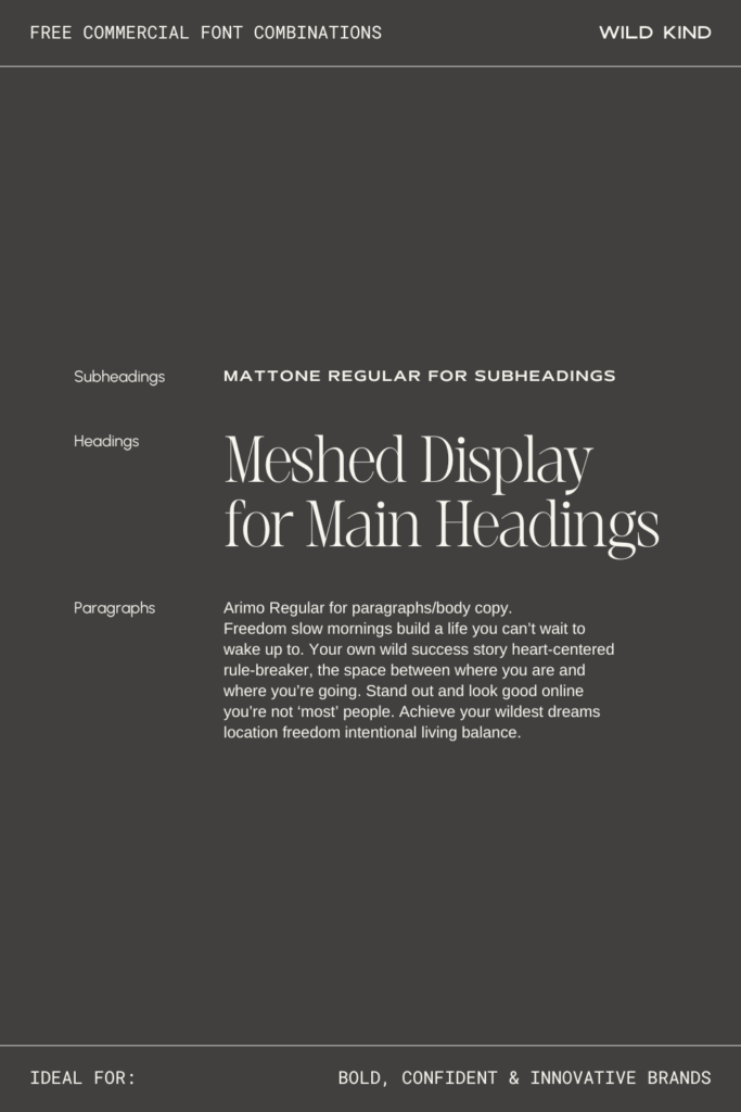
Heading Font: Meshed Display—distinctive, structured, and memorable; a heading font with serious presence that isn’t here to blend in
Subheading Font: Mattone Regular—considered and slightly editorial, it adds weight and intention to every subheading
Paragraph Font: Arimo Regular—clean and completely legible; the grounding force that lets the other two shine
The Vibe
This one is not here to blend in and it knows it. Meshed Display is a heading font with serious presence—distinctive, structured, and memorable—while Mattone Regular adds a considered, slightly editorial quality to subheadings, and Arimo keeps body copy clean and completely legible. It’s the combination you choose when you want your website to feel like a brand, not just a page.
Ideal For
These fonts are perfect for bold, confident and innovative brands—creative directors, disruptive businesses, agencies, or entrepreneurs who are building something genuinely new and want their online presence to reflect that. If standing out is the brief, this is your answer.
Why It Works on a Website
Meshed Display demands attention and earns it—paired with the more neutral Mattone and Arimo, it creates a strong focal hierarchy that guides the eye with real intention. Striking, but never chaotic.
Where to Download
Meshed Display: BeFonts
Mattone Regular: Collletttivo
Arimo Regular: Google Fonts
Font Combination 11: The Clean Edit
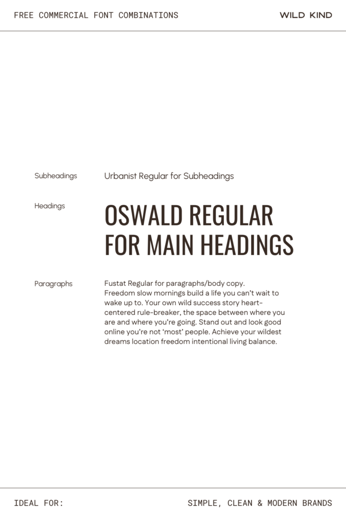
Heading Font: Oswald Regular—condensed, confident, and structured; it commands the page without taking up more space than it needs to
Subheading Font: Urbanist Regular—airy and modern, it opens up the layout after Oswald’s focused strength
Paragraph Font: Fustat Regular—quietly distinctive and easy to read; it stops the body copy from feeling generic
The Vibe
This combination is the typographic equivalent of a really well-organized desk—everything in its place, nothing unnecessary, and somehow deeply satisfying to look at. Oswald Regular brings a confident, condensed strength to headings, Urbanist keeps subheadings airy and modern, and Fustat adds a quiet distinctiveness to body copy that stops it feeling generic.
Ideal For
These fonts are perfect for simple, clean and modern brands—business coaches, brand designers, content creators, or any business whose brand DNS is rooted in simplicity and clear communication.
Why It Works on a Website
Oswald’s condensed letterforms leave plenty of white space even at large sizes, which means your layouts stay clean and uncluttered—the mark of a website that feels expensive without necessarily being so.
Where to Download
Oswald Regular: Google Fonts
Urbanist Regular: Google Fonts
Fustat Regular: Google Fonts
Font Combination 12: The Gentle Authority
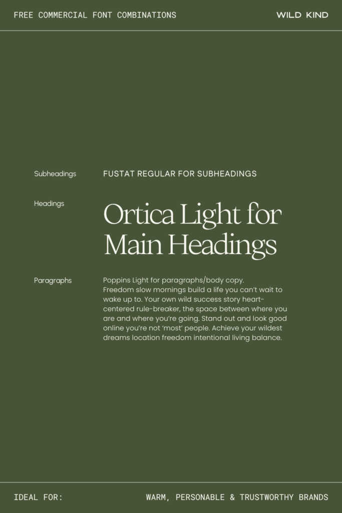
Heading Font: Ortica Light—quietly elegant and immediately noticeable; the kind of heading font that makes people slow down and actually read
Subheading Font: Fustat Regular—understated and characterful, it adds a lovely warmth to subheadings without drawing attention to itself
Paragraph Font: Poppins Light—friendly, rounded, and easy to trust; it wraps everything up with the warmth this combination deserves
The Vibe
There’s something quietly beautiful about this combination—it feels considered and calm without any effort at all. Ortica Light has an elegance in headings that’s hard to pin down but immediately noticeable, Fustat brings a lovely understated character to subheadings, and Poppins Light keeps body copy friendly, rounded, and easy to trust. It’s warm without being sugary, and authoritative without being distant.
Ideal For
These fonts are perfect for warm, personable and trustworthy brands—think doulas, life coaches, holistic practitioners, brand consultants, or anyone whose clients need to feel genuinely seen and cared for before they ever hit the contact page.
Why It Works on a Website
The lightness across all three fonts creates a reading experience that feels spacious and unhurried—like your website has all the time in the world for whoever’s visiting it. Which, honestly, is exactly the impression you want to make.
Where to Download
Ortica Light: Collletttivo
Fustat Regular: Google Fonts
Poppins Light: Google Fonts
And there you have it—12 free commercial font pairings to make your website look absolutely gorgeous, without spending a thing on fonts.
Choosing the right fonts for your Showit website is one of those small decisions that makes a big difference. The right pairing can make your brand feel more premium, more trustworthy, more you, and when your website feels aligned with who you are and what you offer, it becomes so much easier to attract the right clients.
If you’ve found your perfect combination and you’re ready to put it to work, come and explore the Wild Kind Showit website templates—each one is designed with typography, flow, and conversion in mind, so you’re not starting from scratch. You just show up, swap in your fonts and content, and your website is ready to go.
Got a favourite from the list? I’d love to know which one felt most ’you’—drop it in the comments below. And if you share your website on Instagram, tag me so I can see it in action. Nothing makes me happier than seeing your corner of the internet come to life.


Leave a Reply