
Building your own website is easier than ever these days — especially with drag + drop platforms like Showit that make DIY website design so accessible. But that also means it’s easy to accidentally make mistakes in your website design.
Whether you’ve bought a template or you’re creating your own site from scratch, building your own website is the ultimate confidence-inspiring activity to prove to yourself how capable you are. Not to mention, a DIY website is an amazing way to get your business online quickly.
As a designer who’s all about championing DIY, I believe it’s also my duty to make sure you’re doing it properly. And while I’m definitely all for “done is better than perfect”, it’s easy to miss some small things that make all the difference in creating a website that’s polished, professional, and could totally pass for having been built by a designer 😉.
Use this post as a checklist to help you avoid these common DIY website mistakes:
1. Not enough white space
This is probably the MOST common DIY design mistake I see — and one that instantly tells me your website was built by someone who isn’t experienced in design.
White space is designer-speak for the space between and around the elements in your website design (and no, it doesn’t actually have to be white). I like to refer to white space as “breathing room”. Not only does increasing the space around elements look nicer, it makes your content easier to read (which means people are more likely to stick around on your site for longer, and consequently, more likely to end up buying from you).
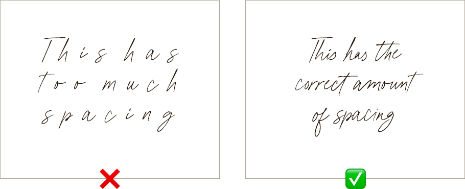
Check out this example below to see it in action:
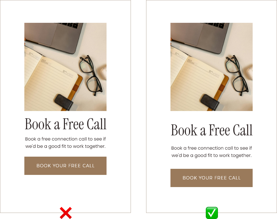
Do you see how the first example is too close together, the button doesn’t stand out, and your eyes aren’t really sure where to look first? In comparison, the second example is much easier to read and just feels more balanced overall.
When you add more breathing room, you also create more contrast, draw attention to your important Call To Actions and generally create a much nicer user experience (which as you probably already know, is really important for getting people to stay on your site).
2. Using too many colors
A surefire way to overwhelm your website visitors is by using too many colors. Our brains naturally look for harmony and consistency, and this is especially true for website design where we want things to be easy to read (and easy on the eyes!).
If you did your own branding, you probably spent a long time picking the perfect colors for your brand, so it makes sense that you’d want to use them every chance you can.
But just because you have a color in your brand palette, it doesn’t mean you need to use it everywhere (if at all) on your website.
I recommend sticking to 3-5 colors for a professional-looking DIY website:
- 1 very dark (think black, dark brown etc)
- 1 very light (like white, cream etc)
- 1 accent color (usually your brightest color)
- And then 2 other colors, normally 1 lighter, and 1 darker so that you have some variety in your color palette and can provide contrast.
In addition to the amount of different colors you use on your website, it’s also important to pay attention to how and where you’re using the colors.
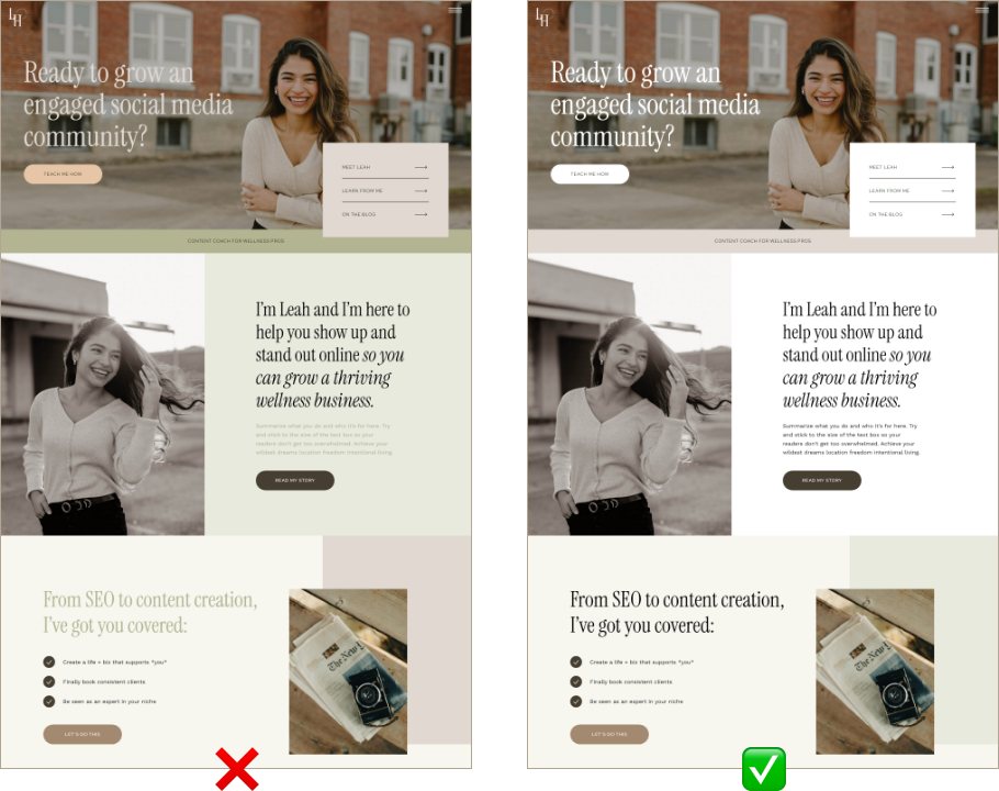
In the example above, the design on the left-hand side looks more cluttered because of the amount of colors used. If we remove some of the extra colors and change how the color is used in the design, we end up with a much more clean, bright and aesthetic looking website.
As a general rule, the less colors you use, the more sophisticated and professional your brand will appear (think Chanel). The more colors you use, the more fun and youthful you’ll look (like Google, for example).
There are exceptions to this rule, but it can be tricky to know how to get away with using lots of color, so I’ll leave that for a topic another day!
3. Not enough text hierarchy
If you’re not a designer and you’ve chosen your own branding fonts then here are a few things to think about when you’re choosing how to use your fonts throughout your website.
Firstly, you want to make sure there’s enough contrast between your fonts. I recommend using no more than 2-3 different fonts MAX. To keep things interesting, you can create contrast by applying different font styles.
Here are some of the most common things you can change to achieve that:
- Font weight (so, bolder/lighter versions of the same font)
- Letter spacing (the space between each letter)
- Italics (if your font supports it)
- Letter case (uppercase/lowercase)
- And of course, sizing
If you only take away one tip for how to fix this common DIY website mistake I see all the time, please, I beg you: size your fonts properly.
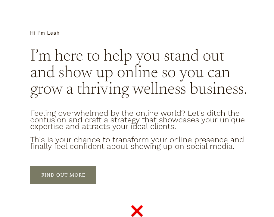
See in the example below how the text all blends together because there isn’t a proper hierarchy between the text?
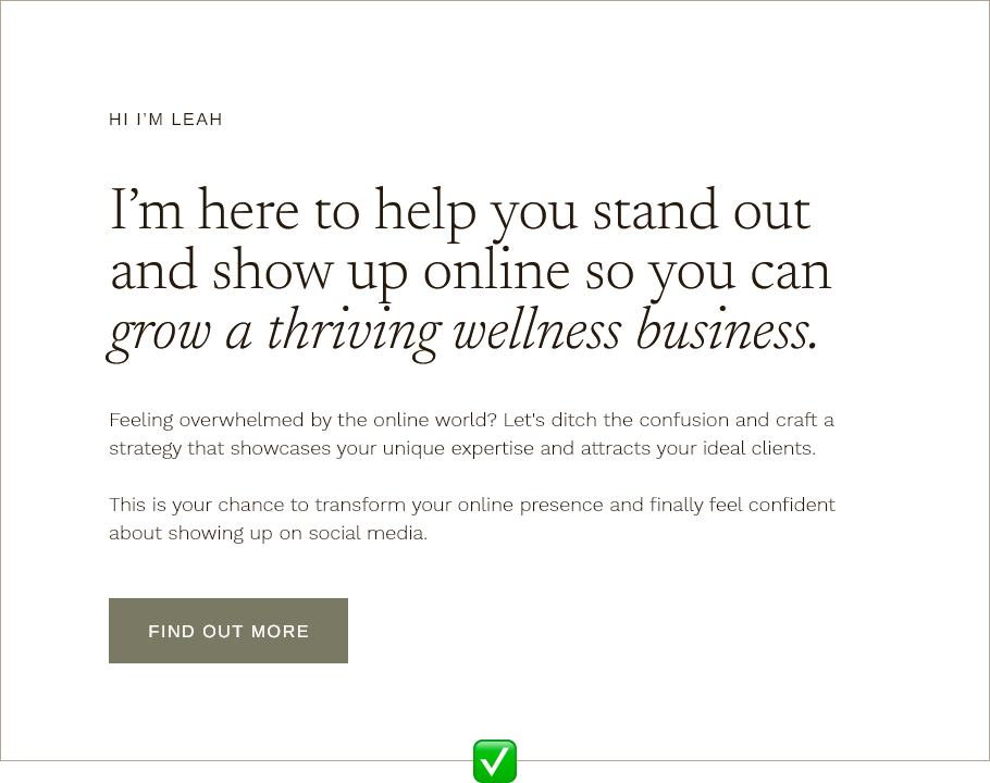
And now, see how much more harmonious and easier to read this is now we’ve used proper text hierarchy?
Another tip for choosing font hierarchy for your website is to stick to uppercase for buttons, subheadings, or very short paragraphs of text. DO YOU NOTICE HOW THIS SENTENCE IS HARDER TO READ BECAUSE IT’S ALL IN BIG CAPITAL LETTERS? Yeah, we want to avoid that for longer pieces of text so we make it nice and easy for people to read 🙂
Bonus Tip: While we’re on the topic of fonts, another common DIY branding mistake I see a lot is with script fonts.
Firstly, script fonts should only ever be used as accent fonts (think of them as decorations, rather than for text that you actually want people to read).
Script fonts should never be spaced out like the first example above; they’re designed to look like handwriting. By increasing the letter spacing, not only does it make it not look like handwriting, it also makes it much harder to read because o f a l l t h e g a p s 😉.
4. No clear Calls To Action
Your Calls To Action (CTAs) should make things super duper simple for people to navigate your website. Here are the two main things to watch out for with your CTAs:
a) There need to be enough of them
If you have a Wild Kind template you’ll see that we’ve included a good ratio of buttons to the rest of your page content.
Your CTAs aren’t just there to get people to buy your services — they also help guide people round your site, taking them on a journey. A good general rule of thumb is to have a button for each section of your website. So, if you have a section that summarizes your service options, include a button that says “Explore Services”. If you have an introduction section on your Homepage, have a button that takes people to read more about you on your About page.
b) They need to be clear and engaging
Avoid having buttons that just say something like “click here” — make it more specific, like “get the download”, or “sign me up”.
CTAs are also a fun way to inject some personality into your site. Notice how “give me all the deets” feels like you’re having a conversation with someone rather than “view more information”? Conversational CTAs are great for helping your website visitors feel like they’re actually chatting to you which helps build connections and create a memorable customer experience (like in the example below taken from our Nola website template).

Steal these fun and engaging CTAs to use for the button text on your site:
- Sounds great, I’m in!
- I need this, like, yesterday
- Let’s do this!
- Tell me everything
- Take me to the checkout
- Count me in!
- See what all the fuss is about
- Tell me more/ Ooh tell me more
- Give me all the info
- Say no more, I’m in!
Ultimately though, clear is better than clever, so aim to keep your CTAs concise and easy to understand.
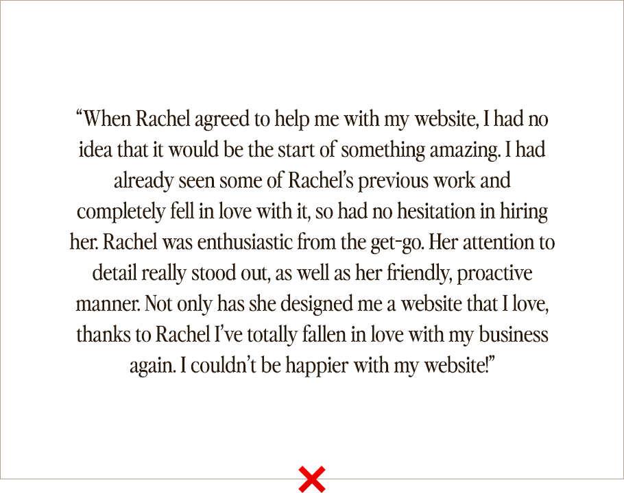
5. Not highlighting the most important parts of your testimonials
This is a really easy fix, and one you can implement today. If a past client has given you some amazing feedback about what it’s like to work with you, it can be tempting to want to feature their whole testimonial on your website.
But instead of copying what they’ve said word for word, use your text hierarchy to be selective about the parts you want to draw people’s attention to.
See the example below for yourself:
Instead, if we focus only on the bits that really stand out, it becomes this:
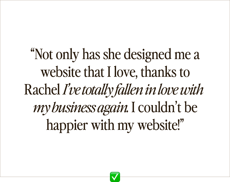
The second version is much more impactful after we cut the backstory about how they came to find me, and all of the stuff about being friendly, proactive, and timely etc as these are all pretty basic things that (hopefully) everyone does! Making someone fall in love with their business again is a less basic side effect of working with someone though (if I say so myself 😉)
If you have a really long testimonial that’s full of absolute gold about what it’s like to work with you, another tip is to split it up and use the different parts in multiple places on your website.
And if you really do want to include a lengthier testimonial, at the very least put the important parts in bold or italics to make it easier for people to read, because if it’s not, they just won’t bother.
6. Writing too much
I’ve definitely been guilty of this (“needs to be more concise” was always written on my English report card at school 😬). But when you only have a few seconds to capture someone’s attention, the amount of words on your website matters.
If you buy a website template and you’re also DIYing your own website copy, my best advice is to use your template as a guideline for how much to write. All Wild Kind website templates come with copy prompts that have been written using a proven sales copywriting formula, and one of the things that makes that formula so effective is the length of the text boxes.
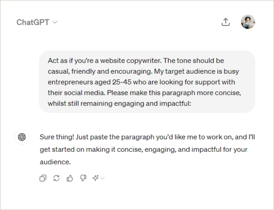
One of my favorite tips for writing your own website copy is to write whatever you want to write and then use AI to help shorten it.
Some of my favorite AI tools for DIY copywriting are:
Here’s an example of a prompt you can use (just adjust the bits in brackets to suit your brand):
“Act as if you’re a website copywriter. The tone should be [casual, friendly and encouraging]. My target audience is [busy entrepreneurs aged 25-45 who are looking for support with their social media]. Please make this paragraph more concise, whilst still remaining engaging and impactful: [paste your text]”
Making things easier to read is also where your text hierarchy comes in. If you do have longer chunks or text, you can split it up across a few sections, using different text sizes/weights etc to break paragraphs up so that your website visitors find it easier to read.
Final thoughts on designing your own website
Follow the action steps and avoid the DIY website design mistakes in this post, and you’ll be ready to build a professional website that turns your dream clients into reality.
Starting from scratch and feeling overwhelmed? Our website templates will give you a great head start. With most of the heavy lifting already done for you, these templates provide a solid foundation for your future website success.


Leave a Reply